Wednesday 27 January 2010

Creating a Slow Motion and Blurred Edge Effect in Premiere and After Effects

Excellent Student Blog - Especially their AS final coursework

http://wbsmediagroup6sam.blogspot.com/


I came across this blog when looking for images of short film posters and magazine reviews. The design and layout of their blog is highly effect. I was most impressed with their final piece of AS coursework. Looking forward to seeing their A2 piece.

Tuesday 26 January 2010

Codes And Conventions Of Magazine Film Review Pages


Film Review Pages

Avatar - Unlimited Magazine

Immediately obvious is the large use of images from the film. A3 spread is dominated by images which are arranged in a linear manner with a border around it image. The review page consists of one main large image, a smaller adjacent image and a series os smaller images along the bottom. In the case of the film 'Avatar' the images show of the modern CGI effects as well as key events in the movie. Furthermore the images give the audience a sense of the genre of the film. The images don't overlap however the text boxes overlap on to the image. The text used is of a consistent font and size accept from the title of the film which is in a larger font. Furthermore the text is in the same colour throughout the article. The only acceptation to this rule is the text under the title however this fits with the layout and design of the page.

Lady In The Water - EMPIRE Magazine

Many of the traits in 'Unlimited' magazine review are found in this 'Empire' magazine. For example this review contains one large image from the movie as well as one smaller adjacent image. Again the images don't overlap however instead of having a border the main image bleeds to the edges of the page. The text again is of the same font through out the article except for the title. As a result the title stands out from the text. Unlike the 'Avatar' review this article has highlighted a quote from the text by changing its colour and font size. In addition small amounts of text have been added to the top hand right corner of the images to explain what they are showing.


I Am Legend - EMPIRE Magazine

This review shares a large majority of similarities as the previous two articles.
The main difference in this review is that the main image chosen isn't a still image from the film. Instead they have chosen an image which shows the making of the film.

Overall the key codes and conventions of a review page are easy to spot and aren't often broken by magazine publishers.

Sunday 24 January 2010

Codes And Conventions Of Short Film Posters


Short Film Posters


The Lethal Innocents - Kirsty Cam
eron - 2007 - New Zealand

"Rita, a 15 year old girl who dances to a different beat, is relentlessly bullied by the queen bees. When they kill her cat, they go one step to far."

Analysis

The main focus of the poster is of the lead character Rita. She is placed centre in centre of the frame and depth of field has been utilised to blur the characters behind her. This technique makes her stand out from the crowd and is a reflection of her character in the film and the way she is represented in the film. The fact she is framed in the centrally and her image takes up a large proportion of the poster shows her importance to the film. In addition her gaze is directly at the vie
wer. This eye contact combined with her facial expression creates a sense of unease in the viewer. The above techniques provide the viewer with an insight to the genre and feel of the text.

The title of the film is placed midway down the poster. As a result the name of the film isn't as immediately obvious as the close up of Rita. The misaligned, almost hand drawn, title further reflects how the character doesn't conform to the norm of society. Thus the audience is shown the personality of the character and due to conventions of genre, the audience can depict from her character profile that the film will be of the psychological drama genre. This is of a similar genre to my short film.

Must Peeter - Pritt Paasuke - 2008 - Estonia

Similar to 'The Lethal Innocents' poster, the 'Must Peeter' poster has a centralised close up of the main character of the film. However in this poster the camera angle is much lower and the actor isn't looking
at the camera. This shows the character to be powerful and mysterious. In addition the character is smoking and his facial expression is unclear. In British society this representation is common to the working class. I believe this to be similar to society in Estonia. This character profile is common to the codes and conventions of drama based films. The black and white image also provides the audience with an insight into the characters mood and feelings in the film further emphasising the drama genre of the text.

Unlike 'The Lethal Innocents' the title of ' Must Peeter' is in a bold serif font and takes up a much larger proportion of the poster. In addition the title is placed at the top of the image and doesn't overlay on to the main image of the character. This makes the title stand out much more and is much easier to read and recognise.

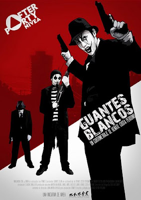
Guantes Blancos - Claudia Caballero - Spain

Unlike the previous two posters the 'Gauntes Blancos' poster contains full body images of the three main characters. In addition the images have turned from bitmap photos into cartoon like vector images. This style is a common to the crime drama genre. In addition the background of the image is in a similar vector style however depicts a city scape. Furthermore the characters are depicted in their full costume and holding their weapons. These are also common conventions of crime drama as well as the city location.

Similarly to 'The Lethal Innocents' the title is printed in a rough, worn looking sans serif font. The title is placed midway down he poster is similarly again to 'The Lethal Innocents' placed over the image of the character. This reinforces the fact the character is integral to film and in addition the character profile is one that you would commonly find in the genre of the film.


Shared Codes and Conventions

Each of the above posters are different in many ways. However some common features appear in them all. All of the posters contain images of the main characters in the film. Generally the main character is positioned centrally in the poster. Furthermore the lighting, colour scheme and position of the actors is a reflection of the characters in the film. Also the codes and conventions of the film genre are reflected in the layout, font choice and title positioning of the poster.

Rough cut - First Three Minutes


I feel the editing of the shots inside the lift went well. The scene works well with

the rest of the footage and the narrative flows well. In addition I feel I have
created the representations of adults and youths. The adult character, James is
shown to be well dressed and looks down on the youth behavior and habits.
This representation is common to the social stereotype of the middle class.
Juxtaposing this are the two youths. One is dressed smart and the other more
casual. However through my editing technique and sound I show them to have
little respect for the people around them. This again is a similar representation of
a social view on societies youth. These representations tie in well with my narrative
as it emphasises how James gets overly agitated and aggressive towards them.

The only reshoot necessary is the initial shot of James entering the building. It
is obvious that it is dark outside and thus subtracts from the continuity.


Shooting - 17th December

Today I filmed the shots inside the lift (Scene 3). The shoot went really well and I believe all the footage turned out well. I learnt from my issues yesterday that it's best to get all the footage and plenty of takes on the same day and occasion this will result in the continuity of the footage in terms of colour and lighting.

Shooting - 16th December

Today I re-shot the tilt shot from scene 1. This went really well however there where some difficulties. Firstly the lighting and colour balance of the new shot was different from the first shot. As much as I adjusted the exposure, white balance and contrast the shots looked different. As a result the footage looks odd (in terms of colour) when edited next to the first footage. However I don't feel this will affect my work too much as the narrative and feel of the piece isn't too greatly affected. To improve from this mistake I will take greater care when on shoots to take not of the time (as it effects lighting conditions) as well as the aperture and capture speed used on the previous shoot.


When I edited the tilt shot I decided to use a slow motion effect on the footage. This editing technique juxtaposes the previous jump cut editing in the opening of the text. I believe this combination works effectively as it emphasis the unusual nature of the film. Also the slow motion effect builds suspense in the revealing of the identity of the protagonist.

Saturday 16 January 2010

Updated Shooting Schedule

Newer Posts Older Posts Home

Blogger Template by Blogcrowds